bruno
est malade
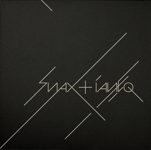
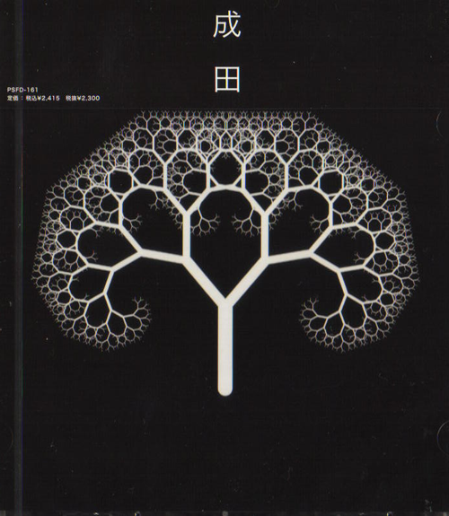
and that aesthetic that spans the whole stable of ammunition imprints (shelflife, tempa, road, soulja, vehicle, sotf) - not just the label artwork but the branded sleeves too. in part, it links back to the clean, vector-based design that was so widespread in the 90s. i like it so much more than that illustrator-spew thing that took over a few years ago.
it could be that the designers are old and have cut and paste experience, so limited use of type (or just helvetica), colours, etc. the grid thing could come more from a designers republic than müller brockmann influence as the first was inescapable in the nineties, the label style being very clean has saved it from obsolescence and dovetailed nicely with the swiss revival now that i think about it. in any case it's an achievement to have a visually consistent house style spanning ten years. the nineties em:t label could have pulled it off but that was a nature photo on one side and black type on the other, very strict!


